Saturday, November 8, 2014

Groovers nursery


Y'all! I'm on a roll here with this blog thing! I'll run out of rooms to show soon then take another hiatus, I'm sure! 

Groovers room is Bowers old nursery. Poor thing. 
I just couldn't justify doing something different. 
If we ever have a girl.... That's a whole different story....but for now it stays the same! 


The guitar/banjo paintings I painted in Dallas before Bower was born. I made the crib skirt with a couple different fabrics I endlessly searched for! Everything I liked and that went with my color scheme was too girly!  So I finally settled on this medallion print and added an orange trim to match the couch!  The crib was free from a lady in Dallas who used it for her grandchildren that outgrew it...SCORE! I just painted it cream. (Which was a serious pain....all those spindles!!!!) 

The orange couch was the inspiration for the whole room (way back when).... It was Jobys grandparents and was covered in plastic it's whole life so when we got it, it was in perfect condition. 

The shaggy rug is from world market. I layered it on top of another larger rug that we already had. 

The original custom curtains I made for Bowers room in Dallas I couldn't use in this house because I only had 1 set and this room has 2 windows so I needed two sets.... These are hand me downs from my mom...which went from her house to my master bedroom and now to the nursery! They aren't my #1 choice but they work for now. 

The armoire I got from the Canton flea market when we lived in Dallas. It is one of the best places on earth. It was in rough shape when I got it... 
Here's a little before and after:
I love this piece so much!! We had to have it for bower because his room didn't have a closet when we lived in seminary housing, so this was his closet! Perfect size for little baby clothes.  Now it holds all of groovers blankets, shoes, burp cloths, and other random things! 

My changing table is from an antique store in thomasville, Ga ( I can't remember the name or which one... But t-ville has GREAT shops downtown) I painted it and the knobs. I wish I had known about Annie Sloan back then because both this and the armoire would have been way easier to redo with chalk paint! My pregnant self didn't love all the prep work!! 
I painted the abstract and the cute frame holds mine and Jobys baby pictures and was from my sweet friend, Claire! 


Some fun close ups of the paintings taken by my great friend, Susan Hudson when she did bowers newborn pictures! 

Wednesday, November 5, 2014

Bowers room

Bowers big boy room......

Bowers room is probably my favorite room in the whole house! It's graphic, colorful, fun, full of different patterns and very eclectic...all my favorite things!  Kids rooms have a special place in my brain. I obviously love color and contrary to my southern roots, my designs aren't anywhere close to being traditional!  I feel like you can do anything in a kids room.... Regardless of what the rest of your home looks like! So even if your house is more traditional in the main living spaces, don't be afraid to go a little wild in your kids spaces!  
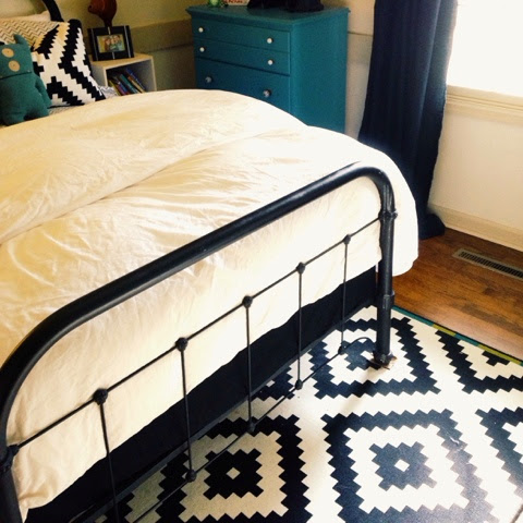
The first thing I bought for this room was the rug (from ikea) I revolved the whole room around it!  I knew I wanted a graphic black and white base with an eclectic mix of colors and art... 


The dresser was Jobys from childhood. I just painted it and got new knobs from hobby lobby.  The cute vintage gum ball machine also belonged to Jobys parents... They found it in their attic and I snatched it right up knowing it would be perfect in his room!  Right now it's filled with all his bow ties.... But there are so many fun things I could put in there... Marbles, race cars, bouncy balls, etc! 

The big painting over the dresser was a wedding gift from one of my very best friends, Curry. We have hung it in many different places over the years, but I think it was destined to end up here. It's pretty perfect in there. 

The curtains are literally black twin sheets from Walmart. $5 each. Can't really beat that! I'm still on the hunt for a fun black and white graphic fabric to put with them... Just haven't found the right thing yet. 


The light is a medium black Decahedron from Art & Soul. One pillow is from ikea (matches the rug) and the other is from hobby lobby (color outside the lines) 
The gray and white chevron sheets are from target and the comforter is just a white duvet cover with a down insert I already had!  And the iron bed is mine from college (it actually just broke, so we are in the process of deciding what to do.... I kind of want to build a rustic barnwood headboard....guess I'll have to blog again for that)  I covered his box spring with a plain fitted black sheet instead of doing a bed skirt... Thought it was more boyish, and I wanted to be able to see as much of the rug as possible. 
His wall art is a bunch of random stuff.... The two framed paintings my mom bought at a yard sale basically just for the frames... But once his room started coming together I decided they were
pretty cute and just kept the art..... Good thing, because come to find out, the artist, Michael P. White, is sort of a big deal. Google him.... He is a children's book illustrator!! His stuff is so unique! Our ORIGINAL paintings are "cowabunga" (a surfer cow) and "toadally sushi" (a sushi eating toad). So cute, right?  
I painted the Dino one and the abstract.  The B is from Tj maxx and the faux moose is from Art & Soul!  

His orange side table is from Art & Soul.


We painted one wall with chalkboard paint and I just drew on it. 

And the other wall has a big world map that I still need to frame (you can see a little of it in the below pic) 

I want to do an old rustic barnwood frame around it.... Which will look cool if we end up building his new headboard that way, too! 
He loves his big boy room and just so you know.....it NEVER looks this clean/put together! 
 
Up next..... Groovers nursery! 

Sunday, September 16, 2012

Annnnnd, were done.....almost

Well, this weekend we put the finishing touches on the house and are officially ready to move in!  

Here is the tour of mainly the kitchen area..

BEFORE:

AFTER:

 BEFORE:
 PROGRESS:
 PROGRESS:
AFTER:
 AFTER:
we decided to leave the cabinet above the microwave open for cook books, and other decorative things.  I went ahead and painted it the same blue as the island.


BEFORE:


AFTER:
my beloved pantry and old doors...they look more distressed in person...and i kept the original knobs on them.....need to get a pic of the inside...lots of storage space!


sink area  BEFORE:

AFTER:

AFTER:


(island area) BEFORE:

 AFTER:

BEFORE:

AFTER:
how about those reclaimed wood wrapped columns!? Do you love them as much as me??
oh and we are planning to tile the fire place with some fun glass rectangle mosaic tiles....

more AFTER:
my island has a different counter than my sink and stove area.  I did granite by the sink and stove and used corian solid surface on the island its plain white....no specks just solid white.


Below is the hallway that I've been talking about putting fence boards on...
Let me tell you, the walls in this hall were in bad shape...the paint was peeling and it just looked rough and uneven...so my options were to re drywall, apply some texture, or cover up with some type of wainscoting....so I decided to take some old fence boards from my parents back yard that they took down...paint them, cut them to fit, and add a picture rail on top for a potential gallery down my hallway....I love that I was able to recycle some old wood that my parents no longer needed!
Ill just lean pictures of various sizes on the ledge overlapping one another and avoid nails in the wall!
what do you think???
 you can see my refinished floors here too...


 here is a close up of the open cabinet above the microwave....

So there it is....I will post more of the bedrooms soon...although not much has changed with them...fingers crossed...we will be living in this beast by the weekend! 

WHEW!

Sunday, September 9, 2012

Here's to buying a house....

Ok, so i realize its been forever.  

And I wish I could tell you that we are moved in and finished with the house....

but i cant.

Believe me,  I WISH WE WERE.  

There are still just so many little things left to do and we feel like if we move in with a million projects left to do....

 we will regret it.  

So, here's to buying a house....

........................

and never moving in it.


................................................................................................................

Although, we have been working....

We bought the old reclaimed wood to wrap the header and columns with....we are using the back side of the turquoise planks...so it will just be brown and old looking.


so below is a pic of part of the columns and header that will be covered....

also notice we hung a fan in this room...we thought it would be smart to have a fan near the kitchen to keep the temp down while cooking....i have big plans for that plain ole fan....

don't you worry


 And here are two of the columns already wrapped....
i pretty much love it
a lot


Also, (i posted this on facebook, so its probably old news) we had some lights hung in the kitchen...
my little (or big) globe pendants are just as wonderful as I envisioned in my mind...

and if you look down the small hall there is a small drum light with metal design around it hanging there and the same one in the mud room...(i don't have a close up, sorry)  we also put two can lights  in the kitchen because we thought it needed more light!


this little gem was on clearance at Lowes and it will be perfect hanging above my large farm table that will go here!


 Again, i already posted this on FB but our counter tops, sink and faucet are installed and i love them too!  Also notice I painted the window and trim around it blue like the island.
what it looked like before:
thank goodness we saved you, you poor little ugly kitchen.


 Another view of counters on either side of the range...already a mess...
we put the cabinet hardware on too.  We still have to make more cabinet doors for the places like above the microwave and where we took out the wall oven and altered the cabinets from their original design....
remember that used to look like this:


And maybe my most favorite part of the entire house (maybe a tie between this and the reclaimed wood columns)

.......my pantry......

its not finished yet, but you can bet your bottom dollar it will be a beauty

below you can see my contractor/best dad in the whole world framing it out...

he is the bomb

dot com


and what is so special about said pantry, you say?

these beauties...well you can only see one, but this old door will be one of my pantry doors.
 boom.


thats all the pictures i have for now.  my camera died and i started working full time last week so I have not been on the ball with my picture taking.

my dad is going to try to finish up the columns/header and pantry by tuesday.  joby put down all the quarter round along the base boards yesterday.....so what do we have left?

make kitchen cabinet doors (about 6 of them)
finish pantry
finish hallway
hang interior doors back on hinges
a bunch of random other stuff that is small and annoying....

So our new estimated move in date is.....


I HAVE NO IDEA!


Tuesday, August 21, 2012

Almost finished!


Ok, major painting has been going on at the house! Also, we laid the kitchen floor, grouted it, and put up drywall and covered the sides and back of the island in leftover paneling....So, here goes:

Mudroom:

BEFORE
 progress

ALMOST FINISHED
Walls: Grey, ceiling: chalky darkish teal
still have to change light fixture...

another view of Mudroom...im leaving the doors natural wood...for now anyway.


View of the floors in the mudroom:
still have to put the 1/4 round back on the baseboards, but i LOVE the floors!
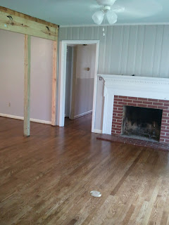


 Here is the kitchen/keeping room.  We painted the mantle white, the walls grey and the island is light blue (one shade darker than the ceiling) but you cant really tell in the picture or in real life for that matter....so I decided last night to paint it a different color....we will get to that later.

Before:

Progress:

 More Progress:
One more of that view:


Opposite view of the kitchen, looking into the dining/living room which is painted grey as well...

BEFORE:
Progress:


Dining room:
BEFORE:

PROGRESS:


View of keeping room on right living room on left...


Ok...now for the island!!  After I painted the ceiling in the mudroom I loved it so much I thought I would put it on the island....and I love it there too!

Before: (light blue)

After:
 
BEFORE of the back:

AFTER of the back with paneling on!

What do you think of the color?  I think the kitchen needed something more bold!


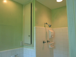
 Oh, and i finally just made a decision on the master bathroom...its green just like the master bedroom. Boring, I know, but its better than the before pic, right?

BEFORE:

AFTER: notice we patched the huge hole in the wall from the medicine cabinet too!

Thanks for touring with me!  Hopefully next blog will be the finished product!

What we have left:
hang barn wood on beam and columns in living room area
build pantry
hang paneling/picture rail down the hallway
put final coat of poly on floors
install farm sink
put cabinet doors and hardware on 
install countertops
paint all baseboards
put up new light fixtures
CLEAN
and im sure there are a million other things im forgetting...

Can we finish by Labor day???  Hope so!